If you don’t have years of graphic design experience, the idea of designing a flyer can seem like a daunting experience.
Not only do you have to come up with the actual design for the flyer, you also have to decide what information will/won’t be included in the design, which application (e.g. Photoshop) you’ll use to create it, and a whole host of other technical nonsense that quite frankly, you don’t have time to learn. It’s for this reason that most business owners often shell out the extra cash to hire a professional graphic designer who can take care of the process from start-to-finish. But it doesn’t have to be this way.
In fact, we’re going to show you how to create an EPIC flyer even if:
- You have no graphic design experience
- You’ve never created a flyer before
- You don’t have Photoshop
And here’s the flyer we’ll be creating:

Pretty neat, right? Let’s get started.
A Quick Word About the Photoshop Situation (important!)
As mentioned above, you don’t need Photoshop to create the flyer in this guide, but it does help.
We’ll be including screenshots and instructions for Photoshop throughout the guide, but if you don’t have it, don’t panic, as there are a few other solutions (outlined below):
Note: The design in this guide is loosely based on a free flyer template on Canva.com. To use this as your base, simply create a free account, navigate to the “Real Estate Flyer” section and choose the “Urban Jungle” template (pictured below):
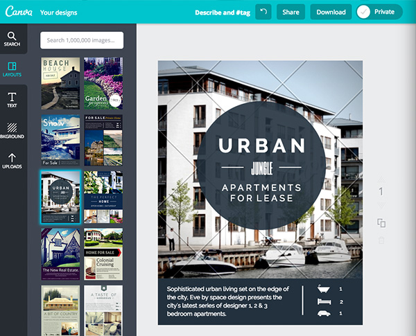
Once you’re set up with your image-editing program (or Canva.com template), all you’ll need is the following:
- Time
- Patience
- A willingness to learn
- Internet connection
- Basic computer skills (i.e. using a web browser, downloading/uploading files, using an image-editing program etc.)
Ok, let’s get started (for real, this time!).
Step #1: Planning and Organising
It’s important that you plan and organise exactly what your flyer is going to say before you jump into the design process. By creating a clear plan like this, you can ensure that the actual design process is as straightforward as possible and also, free of complication.
To begin, answer the following questions:
- What do I want my flyer to achieve?
- What information MUST my flyer contain?
It’s extremely important that you think about the answers to these questions in detail before starting the design process. You should always keep things as simple and straightforward as possible and make sure not to overcomplicate things.
For example, the answers to these two questions when designing our food market flyer might be:
- I want my flyer to inform people about my event (i.e. the Food Market)
- My flyer must tell people when and where the event will take place, how much it will cost, and kind of food will be on offer.
Simple.
Now we’ve defined our aim and contents, we need to decide how this content will be placed and laid out on our flyer. We can do this by dividing the information that must be included into a heading, subheading and multiple text blocks.
Here’s an example for our food market flyer:
Heading (i.e. title of event): The Food Market
Subheading (i.e. slogan): Eat. Drink. Live. Join us.
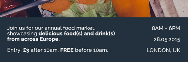
Text block #1 (i.e. event overview): Join us for our annual food market, showcasing delicious food(s) and drink(s) from across Europe. Entry: £3 after 10am. FREE before 10am.
Text block #2 (i.e. time, date, location): 8am – 6pm. 27.05.2015. London, UK.
Less is usually more with flyer design, so keep things as simple as possible. A heading, subheading and 2 – 3 text blocks should be more than enough. If your flyer is too text heavy, people will likely glance at it, get confused and stop reading. This means it won’t have the intended impact.
Now we know what information we want to include on our flyer, we just need to figure out how to arrange it.
Step #2: Creating a Sketch of your Flyer
Next, you need to create a sketch of your flyer in order to plan out what the end result should look like and also, exactly how you’re going to place your information on the flyer.
Note: It’s extremely important that you don’t just open up Photoshop (or another design application) and begin trying to design the flyer from scratch with no plan as to where each piece of information will be placed. This will almost certain result in failure.
Here’s the sketch I did for our food market flyer:
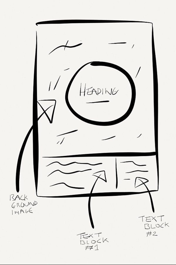
It only took me five minutes to create (I used the free Paper app for iPad, but you can do it on real paper if you prefer) and now, I know where every piece of information is going to be placed on my flyer. I also have a vision of how the flyer is likely to look when it’s complete, which gives me something to aim for during the design process.
In case you can’t make out my handwriting on the image, here’s a quick list:
Heading: Placed in the centre of the flyer with a circular background.
Subheading: Placed in the centre below the headline, but also within the circular background.
Text Block #1: Placed in the bottom left-hand corner, with a black background.
Text Block #2: Placed in the bottom right-hand corner, with a black background.
I’m also including a background image for the flyer to help it stand out. It’s usually a good idea to include imagery on any flyer but remember; these images must be high quality. No pixelated nonsense. It’s usually better to use 1 – 2 high quality images than many small, low-quality ones, as this will only make things look cluttered and confusing.
Step #3: Setting Things Up
To start the design process, you first need to setup your design environment. This will vary depending on the application you’re using but essentially, you just need to create a flyer-shaped blank canvas to work with. Flyer dimensions will vary too (it’s usually best to get these from your chosen print company) but for this example, I’m going to create an 8.5-inch by 12-inch flyer.
Here’s how to set this up in Photoshop:
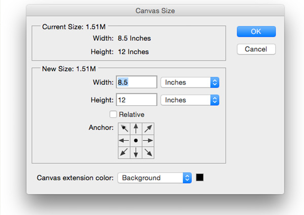
Note: It’ll be similar in other image-editing programs and obviously; the work will already be done for you if you’re using Canva.com.
Step #4: Finding & Placing Our Image
For non-designers, finding images for designs can be a daunting process. It’s doubtful that you’ll have your own photos but luckily, that isn’t a problem, as there are plenty of stock photography websites out there that offer high-quality photos completely free of charge.
Here’s a list of the best ones.
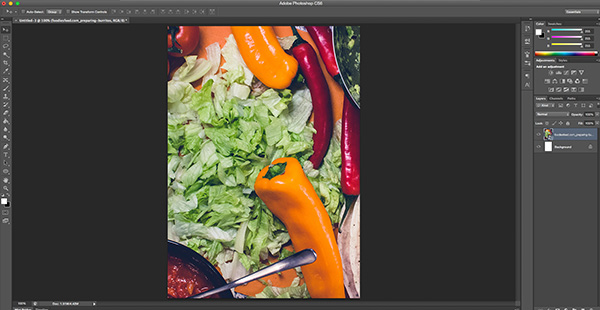
For our food market flyer, we’ll be using this photo:
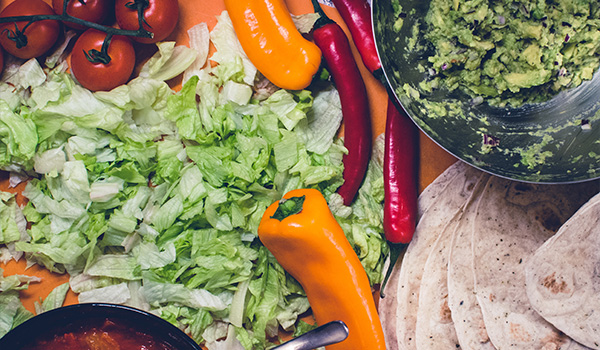
You can download this from FoodiesFeed.com here (just click the “Free download” button). Once you’ve got it, you just need to place it into your design. In Photoshop, you can do this using “File > Place” and then selecting your image. You just need to resize it using the free transform tool.
Here’s the finished result:
Note: If you’re using Canva.com, it’s just a case of uploading your photo and dropping it into place.
Step #5: Adding the Fill Areas
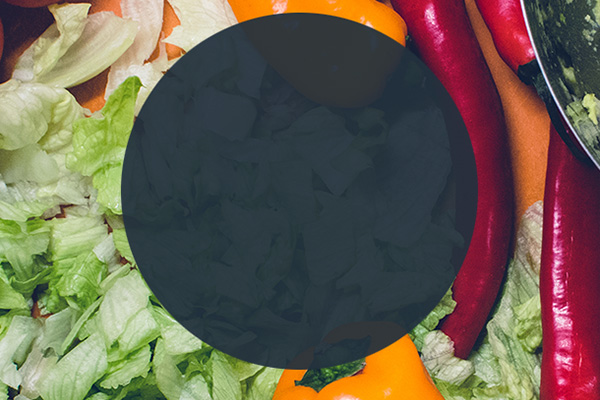
If we placed our white writing directly over that image, it would look pretty terrible. It would also be difficult for the viewer to read, so the next step is to add our (dark) fill areas, which will serve as a background for the white text.
To do this, create a couple of new layers (one for the central circle and one for the bottom rectangle) and use the Elliptical Marque tool to drag out the areas you want to fill. Use the fill tool to fill them in.
Make sure to fill them in with this colour: #23313E
Note: This entire step is done for you if you’re using Canva.com, so move on to the next step.
Here’s the result:

After this, change the layer opacity on the circular fill from 100% to 90%. This will give your circle a slight translucency.
Here’s the result:
Now it’s time to start adding the content.
Step #6: Adding the Headline + Sub Headline
Let’s start with the headline and sub headline. We already know what this is going to say as we took care of this during the planning stage, so this part will be pretty straightforward. It’s just a matter of using the Text tool (in Photoshop) to add and place the text.
Note: The two fonts used in this design are: Raleway and Pinyon Script.
Most computers won’t have these fonts pre-installed, but you can download them free of charge from Google Fonts here and here. The only part of the design that uses Pinyon Script is the word “the” in the headline. The rest of the design is 100% Raleway.
Here’s what the final result should look like:

Any font sizing, spacing, styling and so forth is up to you. You can either try to replicate the design exactly, or put your own spin on things.
Note: For Canva.com users, it’s just a case of dragging content around and arranging it as you please.
Step #7: Adding Additional Information (i.e. Text Blocks)
Lastly, we need to add our two text blocks and any other additional information.
Again, we already know what we want our two text blocks to say and where they’ll be located, so it’s just a case of dragging out a couple of text boxes and copy/pasting in the information.
Note: Make sure to use the Raleway font for the text blocks.
Here’s what the result should look like:
Note: These text blocks already exist if you’re using the Canva.com template; so just adjust them with your content accordingly.
The only thing left to add is the couple of content dividers/rulers. In Photoshop, the easiest way to do this is to use the Rectangular Marquee tool combined with the fill tool to create a couple of slim white lines.
Note: They already exist in the Canva.com template, so just drag them to arrange them where you need them.
Once you’ve done that, the flyer is complete!
Here’s the final result:

A Quick Note on Printing
If you’re planning to create your flyers for printing (i.e. with a professional printing company), there are a few other things you’ll need to think about before creating your design.
Many commercial printers will require you to account for bleed and trim in your designs. Usually, they have templates available that incorporate this, but you’ll probably need Photoshop or Illustrator to use them. Just ask your chosen printing company to send you the template files through before you create your design.
It’s also important to make sure that your flyers are legible when printed. Often, people tend to design flyers on a high-resolution computer screen, only to find that some of the smaller text is illegible when printed on small A6 flyers.
If in doubt, order a test print before committing to the full batch.
Conclusion
Although we’ve tried to make this guide as simple as possible, we realise it’s still a lot to take in, especially if you don’t have any previous graphic design or Photoshop experience.
However, we hope it at least helped you to grasp the basics of flyer design and the creation process.
Also, you don’t have to copy the design in this guide exactly as it’s laid out. Feel free to play around with fonts, colours, images and so forth. Let your creativity flow!
If you’d like to see more tutorials like this (e.g. for banners, leaflets, posters etc.), let us know exactly what you’d like to see in the comments section below and who knows? We might even create it!