Designing a folded leaflet can be a difficult task, we should know at fastprint
Not only must your leaflet look professional and ooze your brands personality, but it must also communicate a clear, targeted message to its intended audience in a way that truly resonates. A task easier said than done. You’ve got to define your target audience, decide what you want to achieve, decipher the best and most hard-hitting way to present your message(s), choose the most appropriate folded leaflet style, decide upon a content layout, and of course, actually create your design.
With so many things to take into consideration during the design process, it’s easy to end up with a confused, cluttered design that doesn’t fulfil its purpose. The aim of this post is to guide you through the entire process from start-to-finish and to help you to create a successful folded leaflet that generates a positive ROI.
Let’s get started.
Step #1 – Figure Out Who You’re Targeting
The first step is to define exactly whom your folded leaflet will be targeting. By doing this, you’ll be able to craft a better, more personalised message that will be more likely to resonate with the intended recipient. To do this, you need to build up a “persona profile” for the target recipient.
Start by asking questions such as:
- Are they predominantly male/female?
- How old is he/she?
- Is he/she an existing customer or potential customer?
- What pain point(s) will your folded leaflet be tapping into?
- What are his/her common objections to your product/service?
You can add in or remove any questions you like. The important part is that you’re able to build a picture of the person you’re hoping to target with your leaflet, as you’ll need to know this in the next step (i.e. crafting your message). It’ll also help you to figure what kind of design will be most likely to resonate with your target demographic.
For example, if you discovered that you wanted to target young (25 – 30), sophisticated, art-lovers that despite loving art, struggle to find art exhibitions that match their taste(s), you might be more included to design something along these lines:
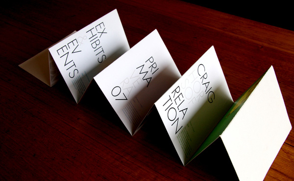
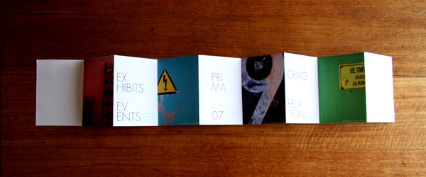
source: www.behance.net/gallery/MCA-A5-Brochure-Design/209...
….than these lines:
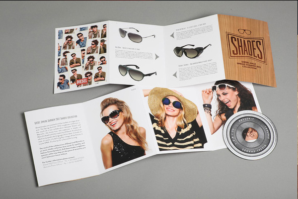
source: www.behance.net/gallery/Diesel-SS12-Eyewear-Collec...
They’re both great designs but clearly, each design style is extremely different and suited towards entirely different demographics.
Step #2 – Crafting Your Message
Now you know exactly whom you’re going to be targeting with your folded leaflet, it’ll be much easier to craft your message. It’s important to note that crafting your message doesn’t involve writing every last bit of text that will be included on your folded leaflet (at least not yet), but rather deciding upon the overall message you want to communicate with the leaflets recipient.
Following on from the questions in step #1, the next step is to build upon your answers to these questions and ask a few more follow-in questions such as:
- How does my product/service solve this person’s pain point, and how can I communicate that in a folded leaflet?
- How can I overcome this persons objections to my product/service (identified in step #1)?
- What imagery and design style is this demographic likely to resonate with and respond to? (E.g. energetic, minimalist, etc.)
- What incentive might this person need to become a customer? (or take a different action if they’re already a customer).
Don’t forget that at the heart of everything, you should be creating your folded flyer to achieve something quite specific. Answering the questions above simply helps you to figure out how you’re going to achieve that thing.
Example
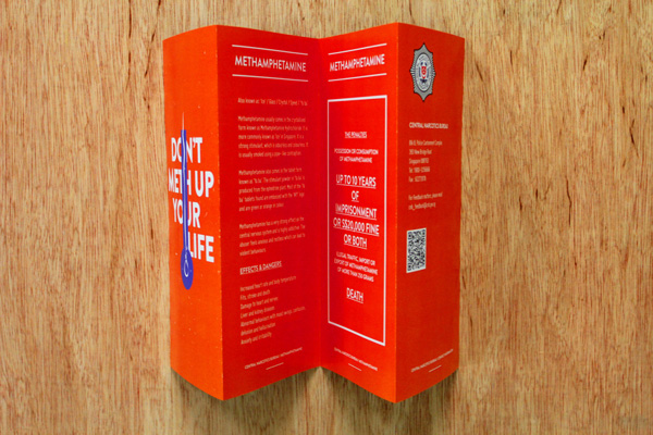
Let’s assume that you were a charity or organisation looking to prevent young people (18 – 25) of both genders from getting involved with drugs. It’s likely that a bold, hard-hitting design, probably with an impactful headline, would be needed in order to resonate with such a demographic. It’s also likely that you’d need to present some pretty hard facts if you wanted to convince them to take a certain action (i.e. to not get involved with drugs). You’d also need to solve their pain point, which in this case, might be something as simple as a lack of education on the subject.
With that in mind, the result might be a folded leaflet like this:
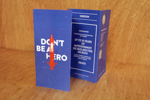
And this:
source: www.behance.net/gallery/A-Project-for-the-Singapor...
Remember, you’ve got a lot of space to play with when it comes to folded leaflets, but that doesn’t mean you should overload them with information. It’s important to distil your message down to what’s necessary, and only what’s necessary.
Nothing more.
Step #3 - Choose a Fold Style
Ok, so you’ve figured out exactly whom you’re targeting and you’ve also got a good idea of the message you want to get across and how you’re going to do so. The next step is to choose a fold style for your leaflet.
There are four common fold styles. Here’s a brief overview of each of them:
Single Fold
source: www.behance.net/gallery/Foodland-Spring-Recipe-Boo...
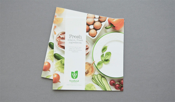
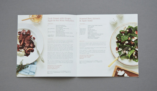
The single folded leaflet is perhaps the most common choice when it comes to folded leaflet designs. As you can see from the example image above, they open in the same way that a book does and therefore, they tend to be simple, effective and easy to use (i.e. they don’t confuse people with “fancy” folding). Leaflets of this style often contain numerous pages, so they’re a good choice if you want to lay out your information in a systematic and chronological manner (such as with a leaflet full of recipes, like in the example above).
Everyone is used to reading a book in this way, so you can rest assured that no matter whom your target demographic is, they’ll know how to handle this kind of leaflet.
Letter Fold
source: graphicdesign.stocklayouts.com/2011/10/26/what-are-the-dimensions-of-a-tri-fold-brochure/
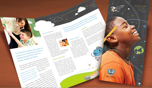
A letter-folded leaflet is presented in the same manner as a letter in an envelope (hence the same). There are two folders and the leaflet is essentially divided up into three rectangular sections. Letter-folded leaflets are great for presenting visual content such as maps, graphics and so forth; this is because they fold up nice and neatly into a relatively small size but when opened completely, all of the information contained within is visible. Much like the single-fold leaflet, most people have come across these leaflets before and are well aware of how they work, so you can be sure not to alienate or confuse your audience with this choice.
Concertina Fold
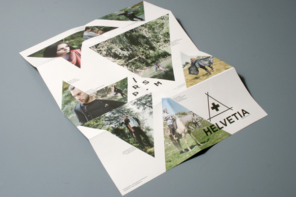
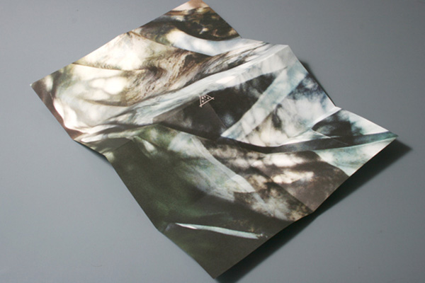
source: www.behance.net/gallery/PRISM-HELVETIA/5386755
A concertina-fold leaflet is usually quite similar to a letter-fold leaflet in its sizing and fold structure. They typically have two folds (although they can have as many as you like) but unlike the letter-fold leaflets, concertina folds require the recipient to open them fully in order to see the content. Because of this, they’re a great choice for displaying highly visual content that is displayed across multiple sections of folds. They’re also a great option if you’re looking to have large visual content on each side of your leaflet as when it’s opened, a concertina leaflet can simply be flipped back and forth from front-to-back with ease.
Gatefold
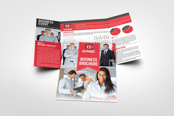
source: www.behance.net/gallery/7788809/Business-Brochure-...
Gate-fold leaflets are pretty self-explanatory: they’re folded in such a way that when the recipient opens them, the experience is similar to that of opening a gate. The great thing about this type of fold is that with a bit of creativity, they can be used in some really interesting ways.
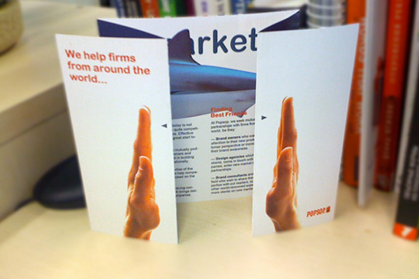
Take this gate-folder leaflet for example:
source: 2.bp.blogspot.com/_nCV5t7EOn7Y/TMgYjN9EwvI/AAAAAAAAADk/vtaAHvzB9IE/s1600/prev9.jpg
When the recipient opens the leaflet, the two hands part ways to reveal the information inside. This is always a great way to make an impact and really resonate with your audience, especially if they’re used to the same old boring leaflets day-in and day-out.
Step #4 - Choose the Layout for Your Design + Content
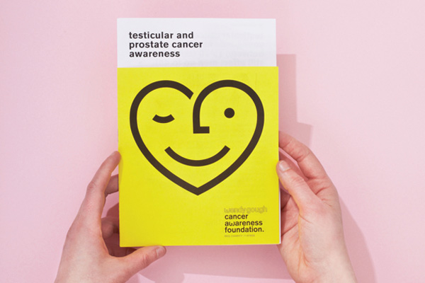
source: www.behance.net/gallery/Wendy-Gough-Cancer-Awarene...
Choosing the layout for your content and actually designing your leaflet can be the hardest part of the process, simply because it’s the part that requires the most creativity. You’ll need to get your creative juices flowing for this one (after all, it’s up to you to decide how to best present your message to your audience), but you also need to keep a few basics in mind.
These are:
- Include an attention-grabbing headline
- Keep sentences short and sweet (you don’t want to overload peoples’ brains)
- Use high-quality imagery that stands out (remember, you want people to notice your leaflets from a distance)
- Keep the colour scheme simple and in-line with your existing branding
- Keep your typography simple (no more than 2 – 3 fonts)
- Include a call-to-action
The cancer awareness leaflet pictured above looks great and does almost everything listed above. It’s got an eye-catching headline, consistent typography, short sentences, bright colours etc. It just fails on one aspect: there’s no call-to-action.
Here’s an example of a good call-to-action in a leaflet (hint: the phrase “turn the page to check out how” is the CTA):
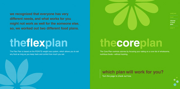
source: www.behance.net/gallery/Weight-Watchers-360-progra...
Note: Obviously, the type of fold you chose for your leaflet in the last step will influence the way you lay out your content to some extent but no matter which fold-type you choose, you need to make sure that your leaflet includes all of the elements listed above.
Step #5 - Set Up Your Design in Photoshop, Illustrator or InDesign
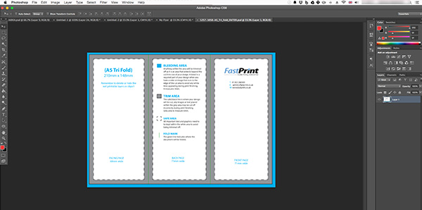
The last stage of the process is to actually set up your project in your chosen application and to start actually designing your folded leaflet (incorporating everything you’ve learnt above, of course).
No matter which application you use, you’ll need to make sure that your setup:
- Uses the CMYK colour mode (not RGB)
- Has a DPI of 300 (double-check this with your chosen printing company)
- Incorporates bleed and trim areas (usually around 3mm on each edge – double-check with your printing company)
The actual setup process can be pretty complicated due to the placements of various folds and whatnot, so the best option is to simply download the pre-created template from your chosen printing company.
If you wish to download any of ours, you can find them here: http://www.fastprint.co.uk/templates/
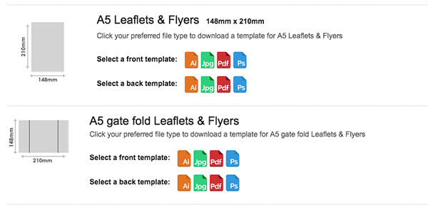
We have templates available for Adobe Photoshop and Adobe Illustrator. There are also PDF and JPG templates if you’re using a different application.
To set everything up in Photoshop or Illustrator, all you need to do is download the template file and open it. When you do, you should see something that looks similar to this:
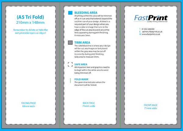
This template will have the correct resolution, colour mode and dimensions already set for you. The best way to start is simply to turn down the opacity on the already-existing guide layer so you can make way for the elements of your design.
The result should look something like this:
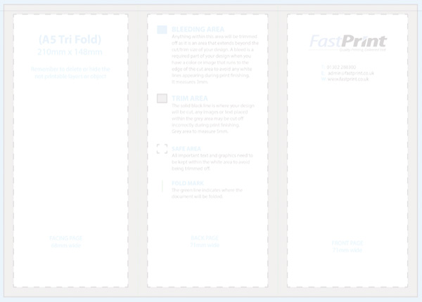
It’s important that you don’t place any important elements of your folded leaflet in the bleed areas, as these should be trimmed after the printing process. Anything you do place in these areas will likely be lost. When you’ve completed your design, all you need to do is to delete the guide layer completely so that only your design remains.
Conclusion
That’s everything! You’re now ready to send your design off to your chosen printing company to begin the printing process. It’s important to note that even when using the template provided and following the advice above, mistakes can still be made, so it pays to let the printing company give your design the onceover before everything it finalised. It also pays to double-check your design for errors, spelling mistakes, inconsistencies and so forth before you commit to the print run. It might pay to get some feedback from friends, family or colleagues as a fresh pair of eyes usually does wonders for any design.
If there’s anything you feel that we’ve missed from this guide, please give us a shout in the comments section below and we’ll do our best to add it ASAP.