We see print ads every day; they're in magazines, newspapers, on flyers and many other kinds of marketing materials but the problem is, if you're anything like me, you probably don't ever take that much notice of them. It would be incorrect to assume that you don't notice them at all as clearly, your subconscious mind is one of the most powerful advertising recipients there is, but it's almost certain that you're not consciously aware of a lot of the ads you see. The reason for this is simple; it's because we see so many of them. As well as this though, I also think it's because most of them are just so damn boring. Think about it, when was the last time you saw a printed advert that really caught your eye and affected you consciously? It's probably been a while.
If you're thinking of creating a print ad for your company such as sticker printing, you need to think outside the box and create something that people are actually going to take notice of. But how do you do that? It's simple; you make sure it's funny and makes them laugh. If you're still struggling for ideas, here are a few print ads that I consider to be some of the funniest ever produced. Sure, it's unlikely that they're going to have you in hysterics, but they're definitely a lot funnier than most of the ads you see these days.
#1 - Pringles - Hot And Spicy

Source: adsoftheworld.com/media/print/pringles_hot_spicy_hot_air_balloon
I'm sure that just about everyone reading this post has heard of (and probably tasted) Pringles on multiple occasions but if you haven't, let me introduce the brand to you. Pringles are potato snacks (basically potato chips) that come in a long tube. Like many snacks, they come in various flavours and new flavours are introduced regularly too.
When Pringles introduced their Hot and Spicy flavour, they designed this extremely funny print ad to go alongside it. Now, I highly doubt that Pringles are going to give you the fire breathing powers to fuel a hot air balloon as pictured in the ad but nonetheless, it's an ad that still manages to grab your attention through the power of humour.
The genius of this ad is the fact that it didn't run alongside any copy (aside from the Pringles logo and flavour in the bottom left hand corner).
#2 - Volkswagen Park Assist - Hedgehog and Fish

Source: adsoftheworld.com/media/print/volkswagen_park_assist_hedgehog_and_fish
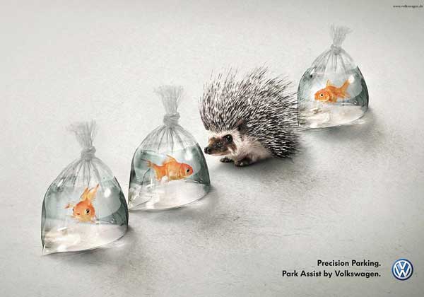
This is one of my absolute favourite ads ever and also, one of the funniest in my opinion. This print ad was created by the well-known car manufacturer Volkswagen to advertise their new Park Assist system that was an optional extra throughout their automobile range.
It's a genius advert and it actually manages to advertise a car related product for a car company without featuring a picture of a car at all. Instead, it's just a hedgehog and three fish in bags.
I'm sure you don't need me to explain the ad to you but one thing's for certain, it's a good job that hedgehog made use of Park Assist technology, or I don't think those goldfish would have been too happy (or alive or that matter).
#3 - Sky Company - The Feeling Never Leaves You

Source: adsoftheworld.com/media/print/sky_company_parachuting_wind
Here's another hugely creative and funny print ad and once again, it's from a relatively small company compared with the likes of Volkswagen and Pringles. Sky Company is a parachuting provider that has the slogan: The Feeling Never Leaves You.
I'm sure you've heard of people saying similar things when they've been parachuting but in reality, they just return to their normal lives. However, as you can see, this ad shows what it would actually be like if indeed the feeling really didn't leave you, ever.
It's a funny ad, mainly because of the image, but it's also a genius way to depict the slogan of the company. It's simple and catches your attention too, unlike most print ads out there today.
#4 - Viola Broadband

Source: adsoftheworld.com/media/print/volia_broadband_titanic
Viola is a super speedy broadband supplier that claims to deliver rates of up to 100mbps to their customers. Obviously, one of the main selling points of a broadband speed this quick is the fact that streaming movies is faster than ever. In fact, you can stream HD content in a matter of seconds at this speed.
The trouble is, many broadband companies utilise their speed as a unique selling point in their advertising campaigns and therefore, Viola decided to get creative with this extremely funny banner ad.
Clearly, the movie depicted in the image is Titanic, although it's a little different to how you may remember it. Surely, Titanic must have been travelling pretty fast to cause the effect that we see in the image, right?
Exactly, that's the point of the ad. The image makes perfect sense when you read the slogan "Get Movies Fast As Never Before".
#5 - Sticky On Both Sides

Source: adsoftheworld.com/media/print/3m_scotch_double_sided_tape_chameleon
Scotch Tape is a well known brand name in the world of tape (a small world I know) and they have a range of various tape-related products that come in handy for a multitude of different tasks.
One of the their products that was introduced recently is Scotch Double-Sided Tape. As you can imagine, tape isn't the most creative industry and creating an advertising campaign with more than an ounce of creativity around such a boring product is never going to be an easy task, but evidently, Scotch Tape managed it.
To market their double-sided tape, Scotch opted for some clever Photoshopping and produced an image of a two-headed Chameleon. For those of you without super-duper Chameleon knowledge, they have a long, sticky tongue.
Clearly, this depicts the product perfectly and in a humorous way.
#6 - Park Assist From Volkswagen

Source: adsoftheworld.com/media/print/volkswagen_park_assist_technology_car_jackglass_truck
Volkswagen is a well known car manufacturer and although they are known for their high quality vehicles, the automobile industry is an extremely competitive one and therefore, one that requires constant creative advertising campaigns.
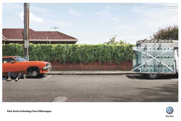
One of the latest features to be introduced by Volkswagen is their Park Assist feature. This basically helps drivers to park their car with the help of sensors and various other technologies.
This clever ad shows just how important Park Assistant technology is by depicting a tight parking space that could be disastrous should anything go wrong. If you were to hit the car behind, you'd likely kill the mechanic working on his car and if you hit the van in front, you're likely going to smash that beautiful piece of expensive glass.
Clearly, a job for Park Assist technology then.
#7 - Pilates With Gerda: Carrying Too Much Weight?

Source: www.pilateswithgerda.com
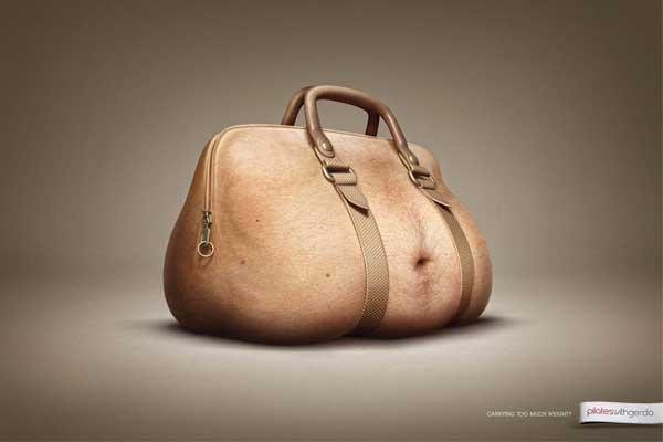
The health and fitness market is massive these days and therefore, it's also extremely competitive. Pilates by Gerda is a company that aims to promote weight loss through a range of Pilates exercises but obviously, with so many other competitors out there, Pilates With Gerda has to fight for their share of the market. This is where their hugely creative and funny banner ad comes in.
As you can see, this ad gives a whole new meaning to the phrase "carrying some extra weight" and it aims to target those that are carrying too much weight. It's a simple ad that makes clever use of photo editing to really stand out.
Although the ad might appear amusing at first glance (after all, it is a "belly bag"), the ad does have a serious message and catches people's attention easily.
#8 - Bose: Noise Reducing Headphones

Source: adsoftheworld.com/media/print/bose_noise_reduction_headphones_waterfall
Bose is a well known company in the world of audio-visual technology and one of their primary products is their extensive range of headphones. One of the headphone features that Bose is now also well-known for (perhaps thanks to this ad in particular) is their noise reducing properties.
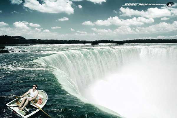
The problem is, how do you depict the noise reducing qualities of a pair of headphones in a creative banner ad? This is how.
You can see from the ad that the rower is wearing a pair of Bose's noise reducing headphones and unfortunately, the noise reducing technology is so good that he can't hear the roar of the huge waterfall he's about to row into.
The guy seems oblivious to the danger that is literally seconds ahead, despite the fact that a waterfall that size certainly isn't going to be quiet.
Conclusion
Creating a funny print ad isn't all that difficult, you just need to think of a clever concept. The best way to start is to round up all of the people in your company and start a company-wide brainstorming session. When it comes to marketing/advertising, genius ideas can come from anywhere within the company, even if it's the person with the lowest salary or least qualifications.
Of course, you could hire an advertising agency but you can be almost certain that this will set you back a few thousand pounds and in the current economic climate, it's likely that most small/medium sized companies haven't got a few thousand pounds spare to spend on print advertising campaigns.